
About Me
Hi! I'm Matt Mike, and I'm a Business Intelligence Developer 👋🏻I focus on creating reports and visualizations for data-forward companies.I’m laser-focused on creating business insights that drive decision making, and I help companies ⚡automate⚡ reports that connect to all their data.I’ve spent 100’s of hours developing reports that save time and money.
Skills

Excel | Tableau | Power BI | Power Automate | SQL | Python
Data Visualization - 3+ years
Business Analytics - 5+ years
Team Management - 3+ years
Report Development - 5+ years
Featured Projects
SQL | Power BI
Revenue Analysis Dashboard
Replaced a manual process by creating a SQL script and Power BI dashboard to pull and visualize revenue data.

Tableau
Company Aging Dashboard
Provides a summary of company account balances.
Python
Marketing Conversions
Created a dataset and visual analysis using Pandas and Matplotlib.

Excel
eBook Sales Dashboard
Product performance analysis and visualization for my eBook, "The Data Portfolio Guidebook." Looks at the first 4 months of sales.
Tableau
U.S. Tech Layoffs
Dynamic analysis of tech layoffs in the US from Jan 2022 - Jan 2023.

Professional Certifications
My growing list of proprietary, exam-based certifications.

Tableau Desktop Specialist | Issued 2023

Microsoft Certified Power BI Data Analyst (PL-300) | Issued 2024
Excel | eBook Sales
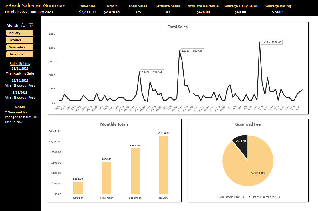
In October of 2022 I released my very own eBook, "The Data Portfolio Guidebook." This project looks at the products performance over the first 4 months since its launch.Here are the questions I was interested in answering:
1) What was the net profit made?
2) Which months had the highest sales?
3) How much was made through affiliate sales?
4) What was the average amount made per day?I took the following steps to create my analysis:
1) Pulling the data from Gumroad, cleaning it, and preparing it for analysis.
2) Creating charts and placing them in the dashboard tab.
3) Utilizing pivot tables to aggregate KPIs at the top of the page.
4) Creating slicers and syncing all tables together for filtering.
5) Formatting all sections of the dashboard and creating an overall theme.Here are my key takeaways:
1) Sales have steadily increased every month.
-2) Running pricing sales can be effective, as evidenced from Thanksgiving weekend, but must be done sparingly.
3) Social validation in extremely powerful. My 2 biggest days resulted from reputable people in the data space posting about the book.The dashboard is completely dynamic and adjusts depending on the month(s) selected via the slicer.
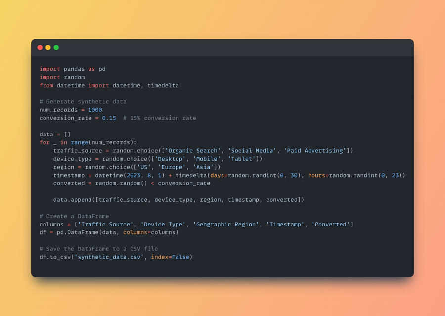
Python | Marketing Conversions
Created a dataset and visual analysis using Pandas and Matplotlib.First, I created the dataset using the Pandas library. This gave me 1000 rows of random marketing data detailing sales conversion rates.
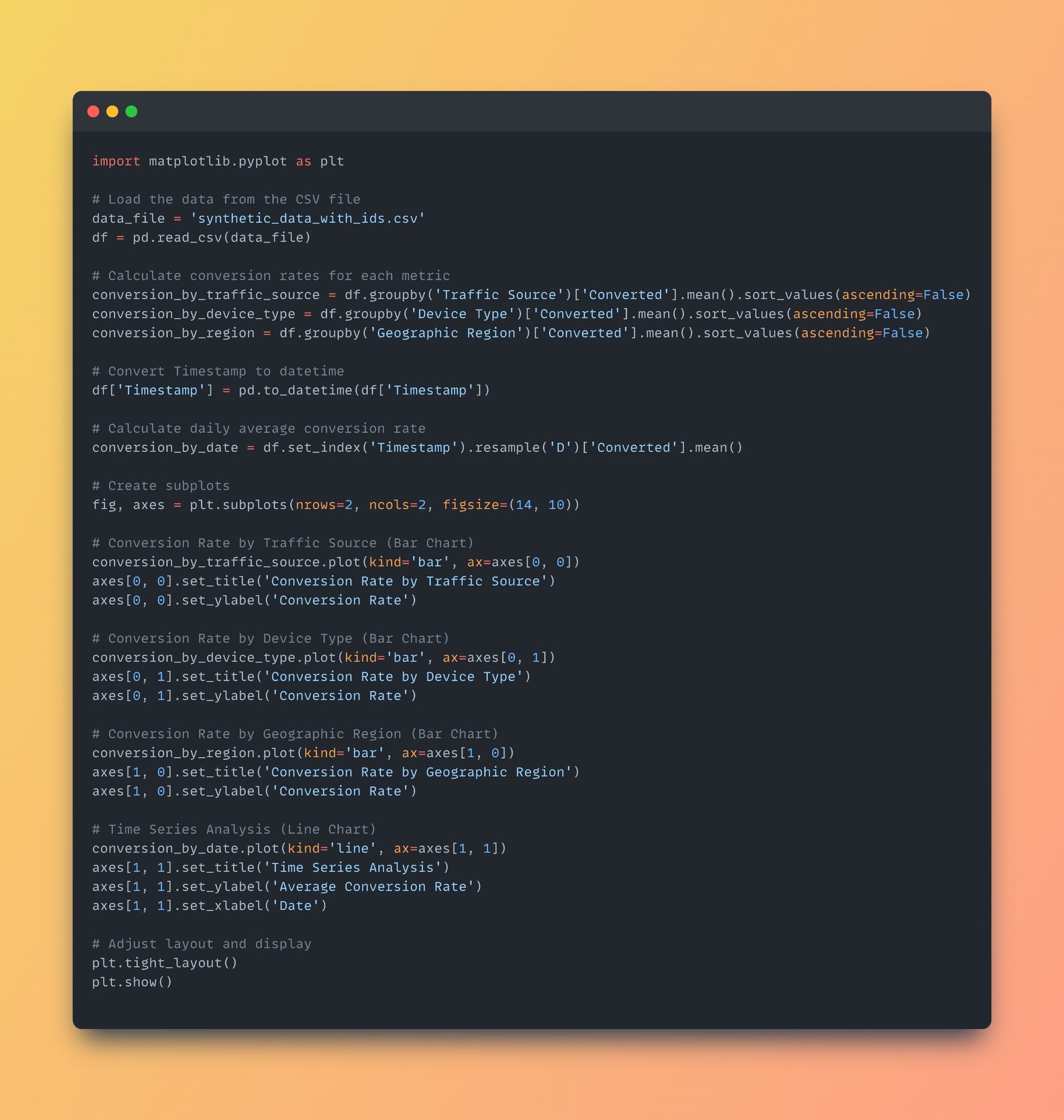
After looking through the newly created data, I wanted answers to the following:1. Conversion rate by traffic source
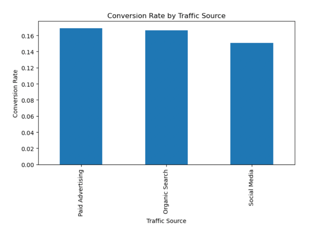
2. Conversion rate by device type
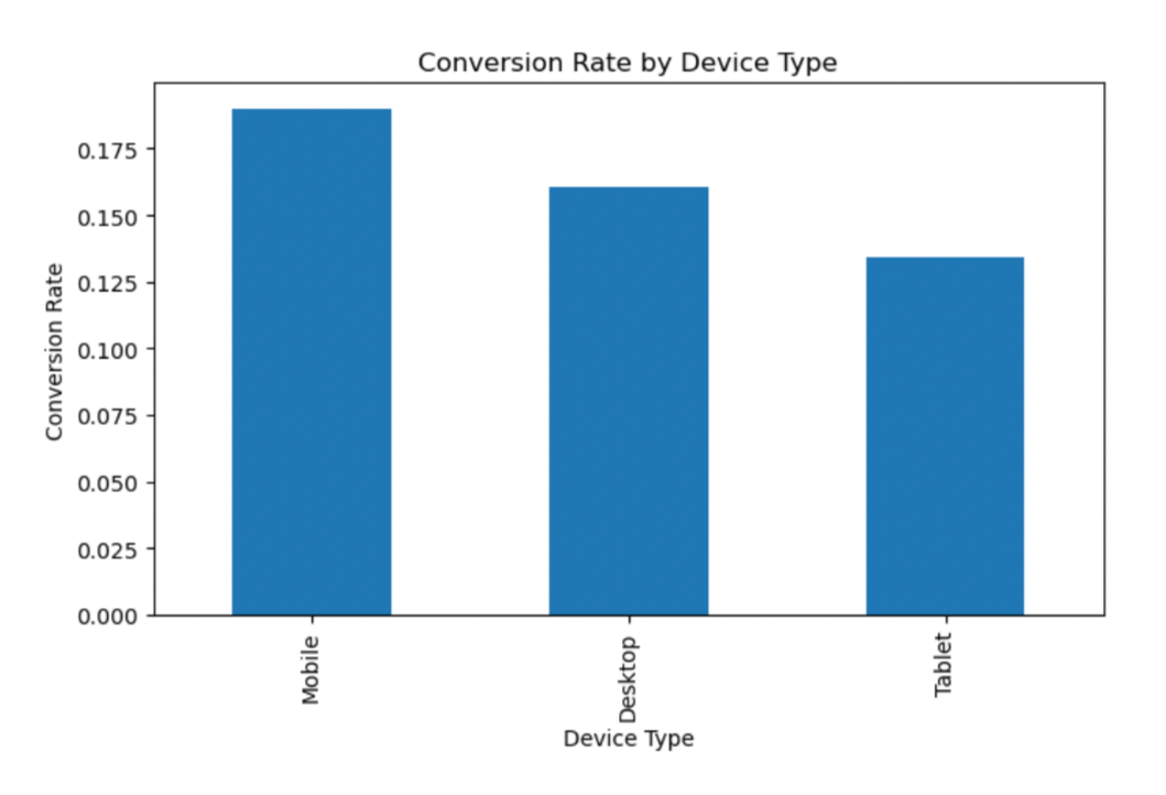
3. Conversion rate by geographic region
4. Time series analysis depicting sales over timeI then created visualizations to answer each of the 4 prompts using the Matplotlib library.
And here are the visualizations generated by the script:
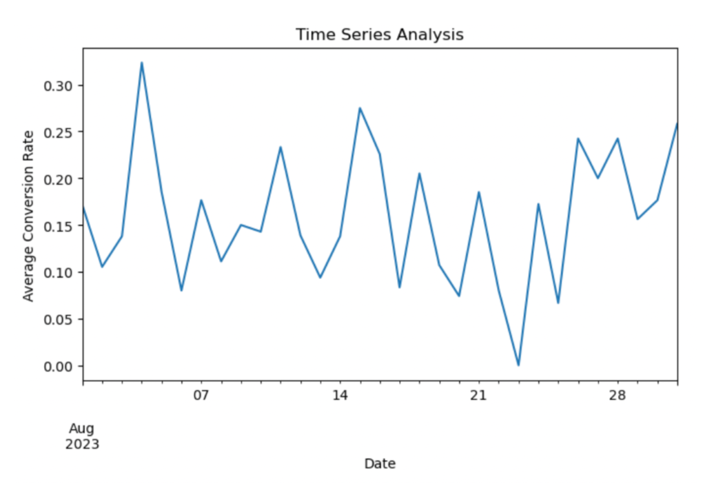
The visualizations resulted the following analysis:1. Paid advertising had the highest conversion rate.
2. Most conversions were made on mobile devices.
3. Europe yielded the highest conversion rate.
4. Most conversions were made at the start of August.
Tableau | U.S. Tech Layoffs
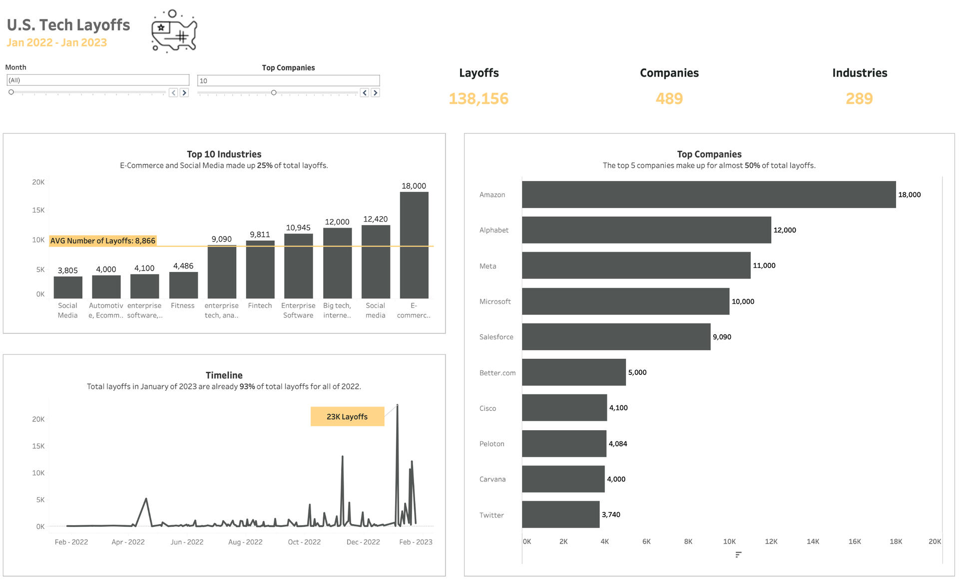
Dynamic analysis of tech layoffs in the US during Jan 2022 - Jan 2023.Genuinely curious about the volume of layoffs the US has experienced in 2022 and 2023, I put together this project to analyze and visualize details.I had the following questions in mind regarding the dataset:
1. Which industries had the highest number of layoffs?
2. Which companies had the highest number of layoffs?
3. How did layoffs trend over the last year?
4. What was the average number of layoffs per month?I took the following actions to create the dashboard:
1. Created a Parameter, Subset Labels, and Top N filter to create dynamic "Top N" filter for companies.
2. Created a column chart ranking the top 10 industries.
3. Added an AVG reference line to column chart.
4. Created a bar chart ranking the top N companies in descending order
5. Created a line chart with a callout adding insight to the biggest spike on the chart.
6. Added subtitles to each chart to add additional context.
7. Set charts, filters, and KPI's into containers for even spacing.
8. Formatting of entire dashboard for complete look and feel design.Here are some key insights:
1. E-Commerce and Social Media made up 25% of total layoffs.
2. The top 5 companies made up almost 50% of total layoffs.
3. The total layoffs in January of 2023 were already 93% of total layoffs for 2022.I utilized the following skills to create this dashboard:
- Parameters
- Top N filters
- Subset labels
- Reference lines
- Calculated fields
- LOD expressions
The full project can be viewed on my Tableau Public page: https://public.tableau.com/views/USTechLayoffs/Dashboard1?:language=en-US&:retry=yes&:displaycount=n&:origin=vizshare_link
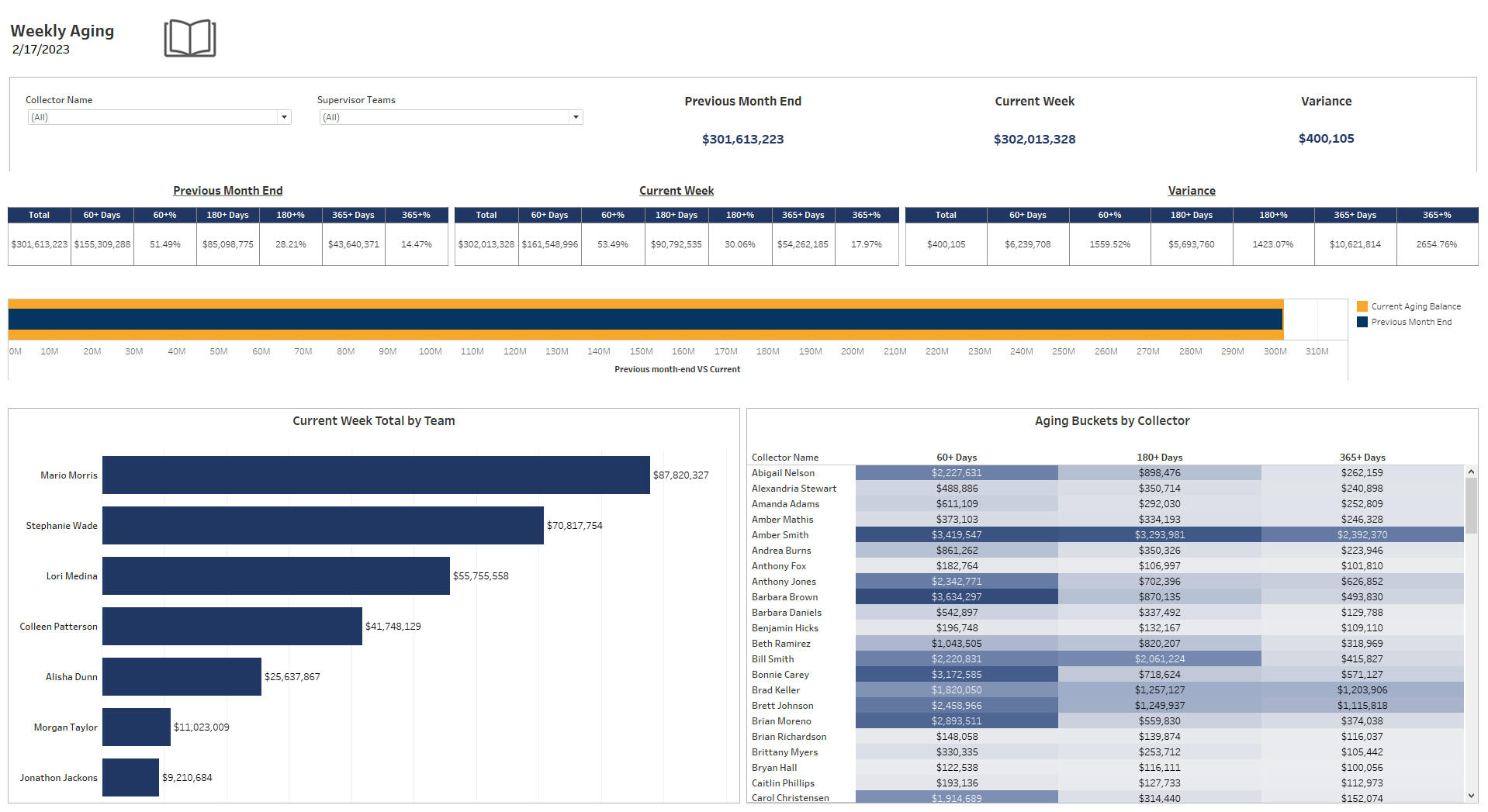
Tableau | Company Aging Dashboard

Created during my time at Willscot Mobile Mini as a Business Analyst. Recreated using dummy data.Provides a summary of company account balances, replacing previously manual process and saving the company 30+ hours annually.The dashboard answers the following business questions:
1. How do current month balances compare to previous month balances and what is the variance?
2. What are the aging balances broken down by team?
3. What are the balances of each aging bucket by individual associate?I took the following steps to complete the dashboard:
1. Exported raw data into Excel and formatted to prepare for Tableau ingestion.
2. Connected Excel file to Tableau report.
3. Created all visible charts to provide analysis on each respective question.
4. Published to company Tableau Server page.
5. Refreshed dashboard weekly by exporting new data and refreshing the dashboard.Dashboard Breakdown:
- Filters are dependent on each other and adjusts based on selections.
- Core KPI's at the top, beside the filters.
- Aging bucket breakdowns for each of the above KPI's.
- Custom bullet chart comparing last months balance to this week.
- Bar chart for a visual on the total aging amount per team.
- Highlight chart to expose larger balances for specific individuals.
SQL & Power BI | Revenue Analysis Dashboard
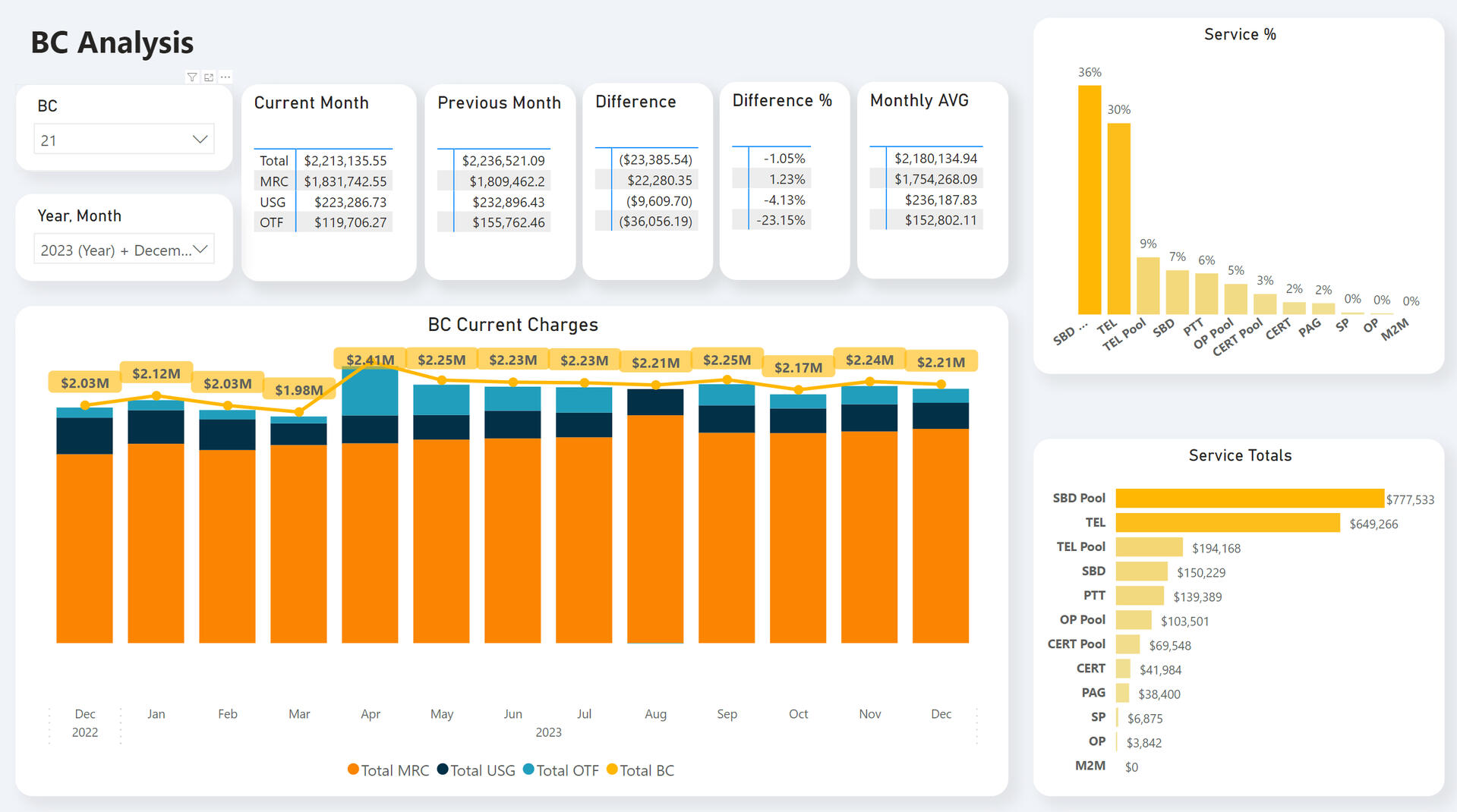
Made for Iridium in my role as a Power BI Developer. Recreated with dummy metrics.Developed SQL script and Power BI report to replace 2 twice-weekly manual processes, saving the company 152+ hours annually in addition to providing filtering capabilities to the report.This report answers the following business questions:
1. What are the current month and previous month balances as well as the variance, variance %, and monthly averages?
2. What are the aging totals by individual service?
3. What are the totals by service type?I took the following actions to create the report:SQL Script:
- Script is 1,300+ lines and utilizes a CTE for improved performance.
The code is then loaded into Power BI for visualization.
Power BI Model:
14 tables were modeled from the primary data source using Power Query.
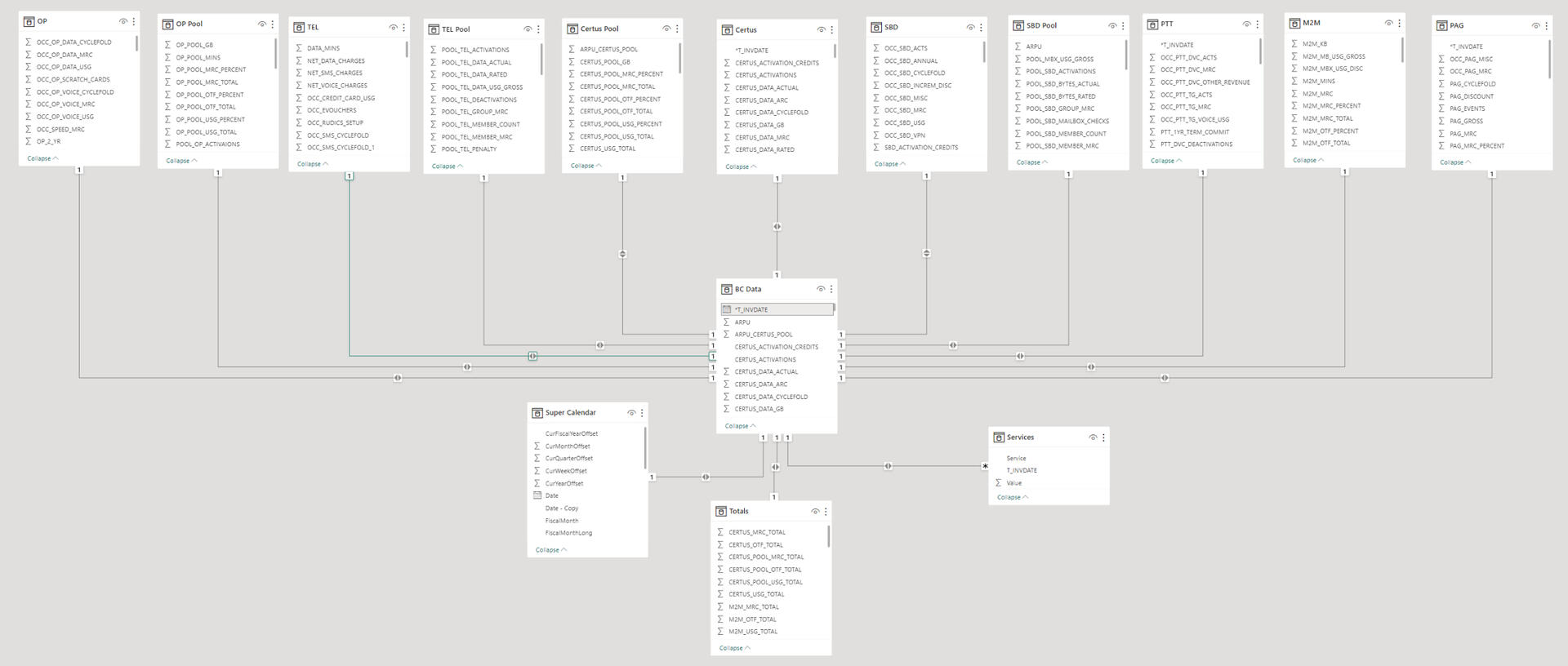
12 individual reports were then created to track revenue for each service.Overview tab:

Service tabs:
Each is modeled in a similar style but tracks metrics specific to that service.
All charts included in report below were required by leadership.
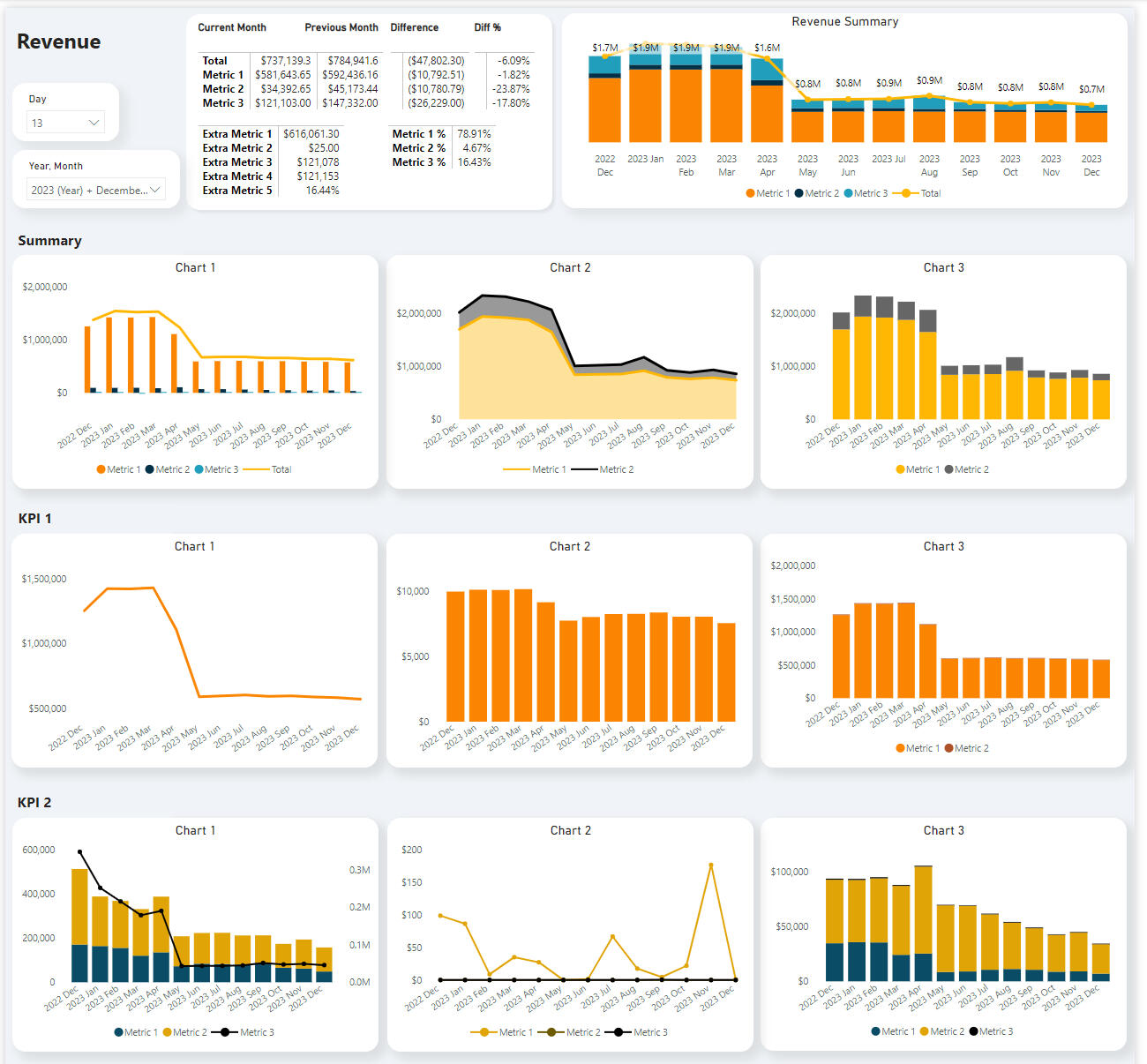
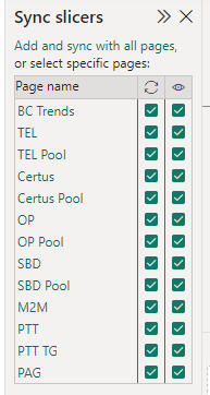
Each tab utilizes a "Day" and Year/Month" Slicer to drill down between bill cycles. The slicers on every tab are synced together.
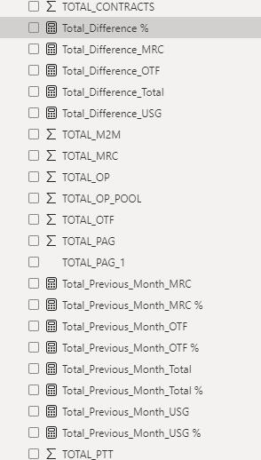
DAX Measures:
12 DAX measures were created for all 12 tabs in the report for a total of 144 DAX measures overall.
- 3 measures created for each fee type.
- 4 fee types per service.
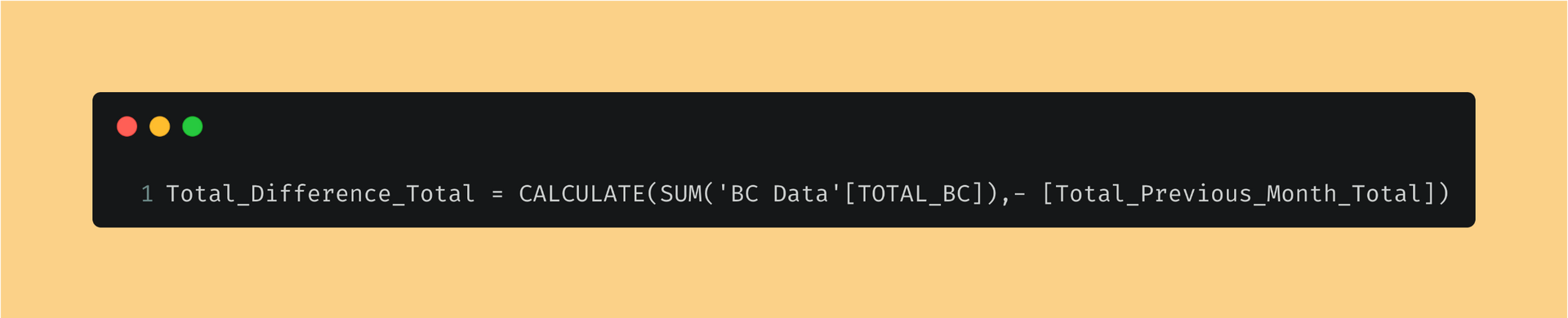
- Total of 12 each.DAX: Previous Month Total

DAX: Difference Total
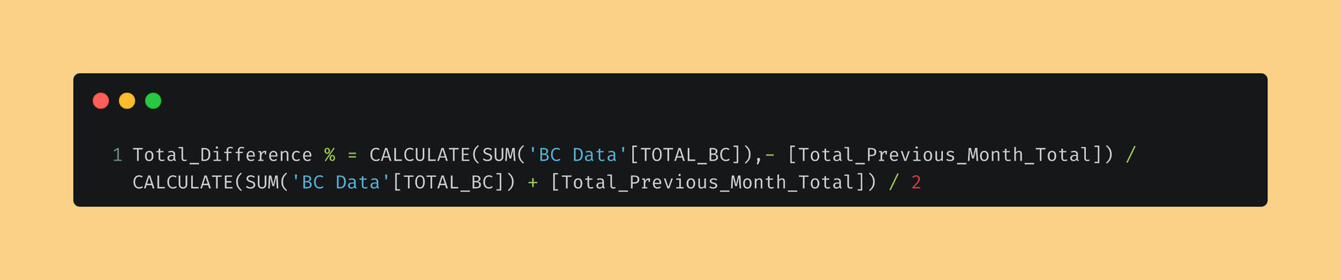
DAX: Difference %
Here is how the DAX measures appear in the measure selection pane.
Super Calendar:
Created custom calendar table to properly represent date measures for charts.
Conclusion:
Overall, this project streamlined revenue reporting, replacing a manual process previously built in Excel and saving the company tons of hours.